Several months ago (that's generous- I'm very behind on blogging) my sister commissioned me to make a banner to give as a gift to her son's Montessori pre-school. Alex (my nephew) was in Kindergarten this past year and it was his last year at the school. Because the school is associated with an Episcopal parish church, the kids go to chapel every week and she thought it would be nice to have a banner for them to carry in. It has been a really great school for both Anna and Alex.
Around Thanksgiving, I went to the school and met with the school director. She talked to me about the school and it's history (this was their 50th anniversary year) and approach. I walked through all the classrooms and through the church sanctuary, and she let me take lots of pictures. I wanted to design something that felt like it fit in with the ethos and vibe and aesthetic of the school.
In touring around the school classrooms, I kept noticing this cross on in-classroom altars as well as the nifty liturgical calendar. And the tree image (the picture on the right is a plaque in one of the rooms I think labeling the parts of the tree) made me think of growth and roots creating a strong foundation.
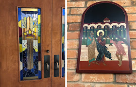
And within the church itself, I was really drawn to both the stained glass and their Stations of the Cross. I thought the rounded, romanesque shape and almost icon-like style was very interesting.
One design struggle is that I wanted the banner to feel like a banner for the school (take a look
here if you want to see them) admittedly a Christian school) as opposed to a church. I've done enough religious/liturgical quilts that my design sense sort of falls back on that naturally. After talking some more with my sister, I learned that a Montessori education has five different areas, Practical Life, Sensorial, Language, Mathematics, and Culture.
I decided on a tree for the central imagery with one branch for each area, with the cross on the trunk and the liturgical calendar in the background. The design mockup is below on the left. The plant represents Culture (which includes science, botany, geography, etc.), The MES 50 represent language and mathematics, respectively and were chosen to honor the 50th anniversary of the school (which goes by MES). The pitchers represent practical life, which includes things like food preparation, washing, manners, care of the environment etc. Finally the binomial cube represents Sensorial. The sensorial category is designed to help refine the senses and includes refining motor skills, developing coordination, and the ability to order and classify objects. I suppose technically the binomial cube probably belongs to mathematics, but it's the most "Montessori" thing I remember from my years in Montessori school (which I loved) so I figured it'd be ok.
Unfortunately, once I finished piecing the border, I realized that it was backwards (you can see the backwards version in this picture) with the liturgical calendar rotating counter-clockwise. I was super mad, but decided to save the first one and use it in one of my projects and piece on for the banner going the correct direction.
This was the top all finished, the trunk of the tree is some sort of thick fake suede, it has a really great texture (though my sewing machine DID NOT like quilting it). The branches are two different gold fabrics on top of a sequined gold mesh, so in person there's a nice amount of depth of color. The border is pieced with a variety of different silks, polyesters, suedes, and velvets, including some hand-dyes, so it also has lots of sheen and depth in person.
I had the back printed at spoonflower, it has the school prayer, all the label information, the school logo, and handprints of the kindergarteners that are graduating and leaving the school this year. It was nice to have all that on the back, but tricky to get it straight and centered on the back of the quilt prior to quilting/squaring up.
And unfortunately, I had one of these. Alas. I hate this-it seems to happen to me more often than not, the backing gets tucked up underneath and I wind up having to pick out a ton of quilting. And this was miserable to pick out- it was clear monofilament on the back on a shiny polyester which snagged terribly, and velvet on the front which was so deep you could hardly get down to the stitches. Yuck!
Come back Wednesday and I'll share pictures of the finished quilt!


