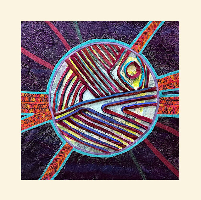
Earlier this week I shared the first steps in my quilt for the Fierce Planets called. I got this far and thought I was almost done but something about the composition was bothering me.
I wasn't even sure exactly what it was that was bugging me. If it was the colors, the way the planet and the background joined together (or didn't join well) or what. I had strategizing sessions with my mom and several fiber friends. Lots of different opinions and very helpful suggestions. My mom thought it looked like pac-man and not planety, but I didn't have a good way to change the lines inside the planet. I tried it upside down to see if it would look less pac-many, but that just looked completely wrong to me, and I finally decided I actually really liked the face that had inadvertently emerged and was not bothered by the pac-man quality. Mom also suggested the orange stripes might be a little too bright for the rest of everything so I overpainted it and liked it better a little duller.
I also decided that the background was a little plain, so I used my shiva paintsticks to add a bunch of shading and space-y shapes to the background as well as a halo around the planet. I liked that, but I still wasn't sure about the composition.
As an oval final shape.
With a little bit of background and a round finish.
None of those were doing it for me. I think the one I liked the best was the round one, but I didn't want to lose my big radiating lines. So I did another mockup, decided I liked it and cut off all the background down to this. And then immediately hated it. I missed all my purple background!!! This felt like a real struggle. Come back later in the week to see how I resolved it!


It’s certainly a process, isn’t it? Digital cameras and computers are such great tools to consider options.
ReplyDelete