Monday, April 30, 2012

Wannabe tutorial: iPad case

Last year sometime I made a pouch for Mike's iPad at a time when he had temporarily switched over to some other tablet and given me the iPad.  I figured he'd get tired of the other tablet soon enough and want the iPad back, so I thought I wouldn't make the pouch too bright so it would be useful even to him.  I chose blues and turquoises, but even then he said it was too girly.  When he inevitably decided he was switching back to the iPad, the blue pouch got put in a drawer.

Well this spring Mike got the new iPad 3 the very second it came out and so gave me his iPad 2 for good.  I got back out the blue pouch but wasn't too crazy about it.  For one thing, I'd made it big enough to also carry the bluetooth keyboard he has, but I hardly ever use that and without it the pouch is too big.  For another thing, I wanted a case that the iPad could stay in all the time as opposed to something that you took the tablet in and out of for use.

I decided to make a case for it (way girly this time) and figured I'd do a tutorial along the way.  I've never done a tutorial before, but I thought this might be a good time.  However, I encountered many weird difficulties along the way and am not certain about the fit of a few things, so I hesitate to call it a real tutorial.  More of a this-is-how-I-did-it-follow-along-at-your-own-peril kind of thing.  Make sure you read through first so you can learn from my mistakes.

I started with an iPad 9 1/2" tall, 7 3/8" wide, 3/8" thick.  Mine already had a slim skin on it, so yours may be smaller.  I cut out the following pieces:

2 pieces of fabric (exterior-dahlias and interior-grellow flowers) H + 1 1/8" x  2W + 5" (10 5/8" x 19 3/4")
2 pieces of stiff double sided fusible interfacing for front and back (like for fabric bowls) H + 1/2" x W + 1/2 " (10" x 7 7/8")
1 piece of stiff double sided fusible interfacing for frame H + 5/8" x W + 1/2" (10 1/8" x 7 7/8")
1 piece of stiff double sided fusible interfacing for closure flap (not actually in the picture since I didn't remember to cut it out at the beginning) H + 1/2" x 2" (10" x 2")
1 piece of fabric (frame) Height of frame interfacing + 3/4" x Width of frame interfacing + 3/4" (10 7/8" x 8 5/8") 
1 long piece of fabric (trim-grellow stripe) 2" x width of long piece (2" x 19 3/4")


I started by turning under the two edges of the long piece of trim and topstitching it down to my exterior fabric piece.  I then sewed the two large pieces of fabric together on three sides, leaving one short side open (right sides together) and curving slightly around the corners.


After turning and pressing, I slid one big piece of interfacing inside the pillowcase, and placed two skinny refrigerator magnets between the fabric and the interfacing on the exterior side.  The idea was that there would be magnets there and on the interior side of the flap closure to hold it closed.  After lining up the magnets, I ironed the fusible into place inside the pillowcase according to the instructions on the fusible.  I then lined up the next large piece of fusible inside the pillowcase, being sure to leave about 3/8 of an inch between the two pieces (see blue lines below) and fused again.  I then took the third, smaller piece of fusible and lined it up inside the pillowcase, lined up the other two magnets, this time between the fusible and interior fabric and fused the final piece of interfacing.  It's important to fold in the raw edges before doing the final fusing (there will be plenty of width of fabric to turn under) so they don't stick unfinished.  I then topstitched along the folded in edges to hold it all together.


Here things began to go awry.  At this stage, you should have basically a folder with a magnetic flap closure. I however, had a folder with a flap closure that did not stay closed.  The magnets were just not strong enough.  I was really hacked because I'd wanted a flat smooth closure, but it just wouldn't stay closed.  I was so aggravated I stopped taking pictures for a while.  To fix it, I ripped out all the top stitching, pulled all the fusible apart and installed two magnetic snaps, one on each corner.  I then refused and re-topstitched, but the snaps felt like they were pulling the fabric away from the fusible so I then sewed around them with my skinny zipper foot to strengthen the area.


The next step was to make the frame for the iPad to slide into.  I took the extra piece of interfacing, rounded the corners and cut out a frame in the middle, including a small cut out for the center button.  I used the other piece of fabric to wrap around the frame (after cutting out the middle).  Once I had the fabric wrapped around the frame, I fused it down and then top stitched around the outside and inside of the frame..


The next step was to attach the frame to the folder case.  I top-stitched the frame to the case, being careful to line up the edges (since the frame is bigger than the case to accommodate the thickness of the iPad).  

When stitching the frame on, I left the following areas open:
1. the entire left side (to slide the iPad in) 
2. the center of the bottom (to plug in the charger)
3. the top of the right side (to access the volume buttons)
4. the left and right of the top (to access the headphone jack and the sleep button

After that, I slid my iPad in and -abracadabra-  iPad case.  All the blue marker is wash away, I just forgot to get it erased before taking the pictures.  


A few things I don't care for to keep in mind if you decide to make one (you can see most of them in the above pictures).  

1. The magnetic buttons are fairly thick which makes the whole thing not quite as sleek as I'd like.
2. I made the frame a bit bigger than the folder part to accommodate the thickness of the iPad, but it kind of bubbled up in the middle.  I'd make it a smidge shorter if I were to do it again.
3.  The frame kind of buckles a bit around the inside.  This seems to be because the interfacing in the frame is flat while the frame really should have a 90 degree bend, i.e. up the side of the ipad then over the front.

I've now used the case for about 5 days and I'm enjoying it.  It's plenty functional and I adore the fabrics.  Problems #2-3 above seem to be partly resolving with time, I think it's just wearing in.  Let me know how it goes if you guys make a case like this!


Wednesday, April 25, 2012

The colors are coming!

I hope everyone has been having a lovely week- the weather here has been just gorgeous so we've been out on Mike's new bike several times and enjoying being outside in the evenings.  It's so lovely to just open all the windows and door in the studio and feel the spring breeze and hear my lovely windchimes.

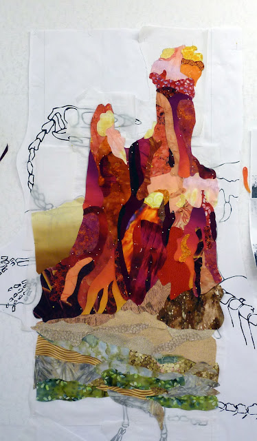
As you might imagine, I've been plugging away this week at Seymour's background, and I'm so excited to finally get to the fun colors.  When I left off last week, I'd assembled the sky section, so this week I did the chimney rock section and the foreground.  I was so so excited this week to break out the colored fabrics.  I went through my stash and pulled out all the yellow-orange-pink-red fabrics I could find and arranged them in a value gradient.


I then went to my background pattern, and wrote in each space what approximate value that shape should have (light, light-medium, medium, etc.) before covering the whole thing with parchment paper.  To assemble it, I used a slightly different approach from that of the sky since I wanted the pattern pieces to have a specific shape.  I took my wonder under, held it up to the pattern and traced the pattern piece (one at a time) onto the sticky side of the wonder under.  After fusing to a fabric of what seemed like an appropriate value, I then cut out the piece and pinned it to the design wall.   Because the pieces needed to overlap in order to fuse together, as I cut the pieces out, I would leave excess where the piece was supposed to slide under another piece and cut right on the line where the piece was supposed to go over another piece.  For the most part,  I tried not to have lighter fabrics on top of darker fabrics (to avoid shadowing) and I think it worked out ok.  


I switched out a few pieces as I went, when I realized they didn't exactly go or I thought I needed a darker or lighter bit, and once I finished all the Chimney Rock section, I sent a picture to my mom.  She thought I needed some more very-dark, so I swapped out a few more pieces to hopefully add some dimension to the rocks.  

To do the foreground, I reverted back to the way I did the sky.  Namely, I had larger pieces of fabric with fusible already on them and I cut and overlapped more ore less random pieces.  I divided the foreground in three sections, the back-most section has the lightest colors and the least contrast while the front-most section has more saturated colors and more contrast.  I'm hoping this gives some feeling of depth.


I can't believe how many pins it took to get it all pinned up.  I went through three full boxes, and my finger is still sore (three days later) from pushing them all into the design wall.  After getting it all pinned up I started fusing it down, making the occasional change in piece placement or fabric as I went.  I'm still not finished fusing the chimney rock part though.  It takes quite a while to fuse it- I'm removing pins carefully as I go and trying to make sure my pieces don't shift in the fusing.

I'm not quite 100% sold on all the chimney rock pieces, but I adore adore adore all the bright pinks and yellows and oranges and reds.  My next step (after fusing the remaining pieces) is to merge the sky section and then start building Seymour.  After I get him in place, I think I'll be able to make better judgments about whether the background needs changes.

I did actually finish a couple of small projects this week, the napkins I showed on Monday and I made a fun ipad case I'll share as soon as I have time to write it up.  Also,  for anyone who read about my sewing machine frustrations making the napkins, I'm pleased to say I got my singer working!  Turns out I had the needle in wrong.

You guys working on any long-term projects?  Doing things with lots of bright colors?  You know those are my favorites!

Monday, April 23, 2012

Not-so-quick Napkins

I'm still working on Seymour, but thought I'd take a break to do a quick project.  I loved Rebecca's (from SewFestiveHandmade) idea to make napkins out of some of your fun prints which are unlikely to make it into quilts.  I have bunches of those,  bold, graphic prints that I adore, but which don't really fit into most of my quilts.

I decided I'd make napkins out of some of them, thinking it'd be a quick, easy project.   I thought it would be fun to have mixed prints so Mike and I would always know which napkin was whose.  I cut my fabric into 10.25" squares simply because that led to 4 napkins in a width of fabric.  I later realized that's a bit small for dinner napkins, but they're ok.

All I was going to do was hem the stupid squares.  Turned out to be the most wretched project!  I hemmed two sides of each napkin and then the other two.  My Janome absolutely would not sew over the corners without gumming up.  Because the hems were narrow, there was nothing to pull or push, and every corner got all knotted up.  I thought about trying my Singer 201, but I couldn't even get it to sew and I still have no idea what's wrong with it.

I finally got them finished and I think they're pretty cute, but not quite as carefree a project as I anticipated.  Mike will be the grellow Amy Butler ones, and I'll be the blue and pink dahlias.


You guys do any recent way easy projects that weren't?

Wednesday, April 18, 2012

Seymour the Coelophysis

I've come to the conclusion that there are going to be a bunch of WIP: Wednesday posts about this dinosaur quilt.  I've decided his name is to be Seymour (thanks Kenda!), and I've been working on him all week.  Although I feel like I've made a lot of progress, I expect this project will take several months.   That's fine for me, but less exciting from a bloggy perspective.  However, since I'm trying out bunches of new techniques as I go, I thought I'd keep posting in case anyone wants to try it out.

When last we left off, I'd finished the dinosaur skeleton pattern and was moving on to the background.  Since Seymour is from Ghost Ranch, I thought having chimney rock in the background would be suitable.  I found a lovely photograph by googling and e-mailed the artist to ask her if I could use it as a guide for value placement in my quilt.  She said no, but I then talked to my mom who mentioned that she had a bunch of pictures of her own of chimney rock from various trips up there.

Side note, Ghost Ranch is a gorgeous place to visit, and my mom has been there several times for all different kinds of art and pottery workshops.  We camped there when I was a kid, but I don't really remember the beautiful scenery.  Two things stand out in my memory though.  The first is that there is some doubt as to whether I ever had the chicken pox (thus the scare in the fall when Mike had shingles), but if I did have them, it was an extremely mild case and I had them on one of our Ghost Ranch trips.  The second thing I remember is one hot dusty afternoon we were hanging out with my dad (who was watching us while my mom was at the workshop) and he bought us a coke from a very old soda machine which dispensed said coke in a glass bottle (complete with bottle cap).  Anyway,  I expect their vending machines have been updated, but you should all check out that part of New Mexico if you ever get out there.

To return to Seymour's background, my mom sent me a bunch of her ghost ranch pictures, and I picked one to use, printed it out in black and white, sketched in the sections I wanted (based on value), inked over the sketch, scanned it in, and turned it into a line drawing in Corel (as described here).  That process worked much better the second time around once I knew more or less how to get the results I wanted.


I then layered the skeleton and the background, resized in Corel, exported the file, and took it to Kinkos.  I thought about printing out the pattern full size on letter-sized paper, but the pattern is 48" x 72" which winds up being 42 pieces of paper.  Aside from the pain in the neck of lining it all up, I'd have to hold it together with tape which would melt during ironing, a problem from a construction standpoint.  So anyway,  Kinkos printed out a full sized pattern for me (even they had to do it on two pages since their large format printer is only 36" wide) and I pinned it up to my design wall!  Hooray!


The first part I decided to work on in fabric was the sky.  I decided to collage it in using a bunch of different blue fabrics all backed with fusible.  For this part, I followed the awesome Melody Johnson's approach.


Since there weren't any pre-defined shapes in the sky in my pattern, I more or less cut pieces out that I thought were nice sky-like shapes. I covered my pattern with parchment paper or the release paper from previously used fusible and then pinned up my fabric pieces on at a time, making sure they overlapped just a little bit and organizing them more or less into a dark-light gradient going upwards.  Once I had them where I liked them, I carefully took out the pins and fused the whole thing together right on the design wall (thus the parchment paper between the fabric and the pattern.  Here's the sky before (with pins) and after fusing.


I then moved the whole sky section away and stuck it to a different part of the design wall so I could start working on the chimney rock section.  The sky section is slightly larger than the final version so that the chimney rock section can be fused onto it.  I plan to assemble the background in three major pieces, the sky, the chimney rock section, and the foreground, then put them together and build Seymour on top.  It's definitely getting more fun now that I've gotten out the fabric!


Monday, April 16, 2012

Baptism Gown

I've been so excited for my sister to have her baby, and we are so happy she's arrived.  I went to visit them last weekend and my mom came out to visit as well.  I'd told Becky I'd make a gown for Anna's baptism, so my mom and I decided to make it while we were there together.

I have a whole bunch of old/antique linens that belonged to my grandmother who passed away a few years ago. Many of them are bridge tablecloth size and we don't use them very much, so I thought it would be lovely to use some of the linens to make the baptism gown. 

Becky didn't want a long baptism gown, she said she'd prefer to have just a cute white dress so maybe Anna could wear it again.  I got Simplicity 2264 and we made the little dress without the skirt overlay.

Anna currently wears a 0/3 months size so since the baptism won't be until June, we made the 6 month size.  We tried it on after we finished making it and it's huge on her though, so maybe she'll be able to wear it for a good long while.

I didn't get a picture of the whole table cloth before cutting it up, but here it is before too much cutting.


We were able to use the edge of the table cloth for the sleeves, the collar, and the bottom hem.  I think we'll tie a purple satin sash around her waist and it'll be really cute.  


It was a really fun project for my mom and I to work on together.  I'm looking forward to the baptism and to lots more clothes sewing for Anna!

Friday, April 13, 2012

Easter Dress

I haven't sewn clothes for myself in a long time, but the white eyelet dress I made to wear for Easter during college is getting very old and worn, so I figured it was time to make another one.

I picked up this pretty white fabric with big brown and silver flowers from the home dec section a long time ago, but never got around to making anything with it.

The pattern is New Look 6699


I followed the pattern fairly closely but I added a couple of darts in the middle part of the bodice to make it a bit more fitted.  The bodice was lined as part of the pattern, but the skirt wasn't.  The white flower fabric was fairly thin so I went ahead and lined the skirt too.  Finally, I used the two fabrics and beads to make a flower to pin at the waist.


I always feel like I look terrible in photos, but I love the way the dress turned out.  Have you guys been doing any sewing for yourself lately?

Tuesday, April 10, 2012

WIP Tuesday: The dinosaur pattern

I usually try to do a WIP post on Wednesdays, to link up with Lee, but this time I'm posting a few hours early because I wanted to link up to Amy's One Thing, One Week Challenge.  I signed up for it last week; basically all you had to do was put your goal for that week in the comments and then link up this week when you accomplished your goal.

Well, I'll state right up front that I didn't completely accomplish my goal, but I did make significant headway (in my mind) on what turned out to be a fairly challenging part of this project.  I suppose it's possible that I only think this part is challenging because I haven't done the next part yet, but at least the next part involves sewing and fusing and quilting, and colors, and I'm reasonably adept at those things.

My goal for last week was to get my Coelophysis art quilt pattern drafted.  I'm making this quilt in response to a SAQA New Mexico call for entries, and the requirement for that show is a long (65"-80") skinny (18"-24") quilt.  I decided to use the New Mexico state dinosaur (Coelophysis) as my subject matter.  I'll share more about this particular dinosaur later, but from a design standpoint, I decided his head and tail should form sort of an S-shape on the quilt top.  That was the only way I could think to fit him on a long narrow quilt, since he's really rather a long horizontal dinosaur.  

One side of the quilt is going to feature the dinosaur's skeleton on a modern day background (Chimney Rock)  and the other side will feature the dinosaur (still haven't decided what his personal name should be, Jerry maybe), on the background he would have lived in (Triassic vegetation, but still desert-ish actually).  To start drafting the skeleton, I thought I'd go to our local natural history museum to take pictures of their specimen, but they don't have a reconstructed skeleton, only this very famous fossil.  Cool, but not exactly helpful for an anatomically correct skeletal reconstruction.

I just realized you can see my tie-dyed reflection in the glass!


So I did some googling, and found these two images to use as references.


Working with the coloring sheet (as a guideline for the shape) under a piece of tracing paper, I filled in all the dinosaur bones based on the anatomy in the other image. The coloring sheet wasn't quite accurate (some of the bones didn't fit in it for example), but it was only a guideline anyhow and I adjusted the shape to fit the bones.  Here's my initial drawing.

Original Skeletal Drawing
Next, I outlined it, so that the dinosaur for the back would match with the skeleton on the front and then scanned both pages into the computer.  My intention was to use the trace function in CorelDraw to turn my line drawings into vector art so I could blow them up at will without losing clarity. 

However, I soon realized that the insufficient darkness of the pencil marks coupled with the texture and smudges on the tracing paper conspired to confuse the trace function and resulted in very poor traces.  You can see below the scan of my original skeleton (converted to a BMP file for the tracing function) and the trace that CorelDraw made from it.  Clearly not helpful.

Scan of original drawing
CorelDraw trace of original drawing

So after playing with the corel settings for a while, I went back to my pencil drawing, and traced it onto bright white copy paper using a fine point pigma pen in dark black.  I then put this in photoshop and used the selection tool to get rid of as much background as I could before putting the BMP into CorelDraw and using the trace function again.  The result still wasn't perfect, but was much better, and I think usable.  From far back it's hard to tell the difference, but up close you can see easily the improvement in the second drawing.

CorelDraw trace of second drawing
Close up of two different traces from CorelDraw


I had hoped to be completely finished with the pattern- background and layers all figured out and ready to print.  The dinosaur part took way longer than I thought though!  Lots of fiddling around with the computer programs trying to figure out how best to get a scalable line drawing.  I may still go back to the photoshop version- it's not scalable in the way a vector drawing is, but it may be better for the pattern.  I'll have to see how they both look when blown up.  

One of the things that I found frustrating with CorelDraw is that even though it has a line art setting for the trace function (affecting how it looks at your picture), it still treats the lines as objects (i.e. 2 dimensional) rather than one dimensional (like a true line).   Practically speaking, this means that each piece of line is an outlined object the thickness of my drawn line (like a very skinny rectangle) rather than a line.  If I set the drawing to have no fill, you can see what I mean.  Look especially at the difference between the right and left arms.  The left arm is the one that CorelDraw traced from my drawing, you can see it's outlined (an object rather than a line).  The right arm, I drew in (using the line/shape tools) afterwards, so it's a line (with adjustable thickness, but still a a line).


For the purpose of making pattern pieces, it would be infinitely preferable if the program could recognize that the lines on my drawing are just that, lines, not objects.  I actually think this may be a feature of some of the newer versions of CorelDraw (X5 and X6) as I hear they have something called center trace, but in the version I have (X3) they just the regular trace function I used.

I have no idea if this is the best way to go about drafting a pattern like this; I use photoshop extensively at work, but I'm a relative newbie to CorelDraw so if anyone has any insights I'd love to hear them.  

Many thanks to anyone still reading!  What a wordy post.  Sorry if it was boring, it's certainly the least colorful post I've ever done!  Hopefully there'll soon be pictures of this at a more fun stage.

Monday, April 9, 2012

Wild Olive Swap Package

I hope everyone had a glorious Easter.  It's one of my very favorite holidays,  there's so much joy and renewal and overall awesome.  My heart always feels so overwhelmed by the wonderfulness, I don't really have any way to explain it.

As you may remember, I participated in the inaugural Wild Olive Stitch Swap, and wanted to show the awesome swap package I received from the fabulous Lisa Hoeg, check out her yummy projects over at Marmalade Smileshine.

She made me this wonderful "bright-on-black" hoop- I love the flower pattern and the polka dots and all of it.  So me!  I put it up in my office so I can see it all the time.  


She also sent this wonderful embroidered "inspire" wrist cuff-  very cute pink on black.  I wore it to work the other day and couldn't stop looking at it. 

Thanks so much to Lisa for the great swap package.  


And finally, because I can't help but share,  Mike-the-great sent me this lovely arrangement of tulips for Easter.  I love bulb flowers of all varieties, and these are so pretty. 


What kind of holiday celebrations are going on in your neck of the woods?

Monday, April 2, 2012

Minky Blankies: The ANIMAL CRACKER is here!

You guys!  The ANIMAL CRACKER is here!  She's called Anna Ruth now that she's born though and is happy and healthy (as is my sister Becky).  Mostly she sleeps and poops, but soon I will teach her to sew.  I, personally, feel that she is the cutest baby ever, although I think most people feel that way about the babies in their vicinity.  I am really very distressed that she lives three hours away.

Anyway, I have wanted to make something out of minky for a while now (just feeling those fabrics is enough to make me want to turn into Linus), so I decided to make a blanket for Anna.  It's probably not necessary since the girl already has more quilts than any one baby can possibly need, but I figured something soft wouldn't go amiss.   Besides,  Becky was anxious for some girly things that weren't pink.  While I was at it, I decided to also make one for Kenda, who recently had a baby and STILL, even though she had just given birth, remembered to send me some awesome scraps of elephant fabric.

I snagged some light green Minky at JoAnn's (on sale!) and some fun giraffe fabric and owl fabric for the backs. I free-motion quilted the baby's names on the fabric and then assembled them more or less as described here.  The only thing I did different was embed folded over satiny ribbons in two sides for the babies to suck on or play with.


I was so pleased with the way they turned out until I tossed them in the washer to get rid of the sizing etc.  Sadly, we had previously done white laundry with bleach and there must have been bleach splatters on the surface of the washer because when I pulled out the owl one, it was all covered in terrible bleached out spots!  The giraffe one was ok, luckily.  I had to go back to JoAnns to grab some more fabric but alas the cute owls were gone.  I grabbed some adorable frogs instead and was able to re-use the green minky since it didn't have bleach spots.    I'd also observed (as I should have realized before), that the cotton shrunk and the minky didn't, so the minky was a little bigger than the cotton on the giraffe one.  When I re-made the second blanket, I pre-washed the frog cotton to avoid that.

They're so soft and fun, I hope the little babies for whom they're destined can enjoy them!


And PS- watch out for shrinking cotton and horrid bleach!