Showing posts with label Gloria Patri. Show all posts

Friday, May 15, 2015

Blogger's Quilt Festival: Art Quilt Entry


It's time once again for the fabulous Blogger's Quilt Festival.  If you haven't checked it out yet, you should- it's always a great opportunity to find lots and lots of fabulous new quilts and bloggers.

If this is your first time visiting here, thanks for clicking through and I hope you'll come back in the future!

This is my entry in the Art Quilt category, a piece called Gloria Patri which I finished earlier this year.  You can see more about it by clicking the Gloria Patri tag in the sidebar.

It's part of a series I'm working on depicting pieces of the Anglican Liturgy, and inspired by the style and motifs found in illuminated manuscripts.  The wording is printed with my handmade silk screens, and features the text of the Gloria Patri (Gloria Patri, et Fili, et Spiritui Sancto, sicut erat in principio, et nunc, et semper, et in saeculum saeculorum amen.) spiraling out both directions from the center.  The central Gloria is an ambigram, that is it reads "gloria" both right side up and upside down.


 I then quilted the piece around all the letters and then with the floral/branchy/leafy fillers.  The quilting colors ranged from various shades of red/blue through to green/purple.  Unfortunately, once I was finished with the quilting, the whole thing felt washed out, so I went back and painted in all the quilting motifs.


The label reads "There is no top and no bottom, there is only the center.  How to regain the center when equilibrium is lost?  Slow, repetitive, meditative stitching; slow repetitive, meditative prayer."  The piece feels to me like a meditation labyrinth, where pacing along a defined path give your brain and heart a chance to rest and refocus.

Many thanks to Amy for hosting the Blogger's Quilt Festival, and to all those who clicked through to see my quilt!

Friday, February 27, 2015

Gloria Patri: Finished

I'm so excited to have finished my "Gloria Patri" quilt.  In case you haven't seen the in progress posts, they're here.  Mike took photos for me over two days this week, and then yesterday evening I finished sewing on the pockets.  I'm so grateful that he took the pictures  (some of them are here in the post)- I hate doing it, but even more importantly, I can only get good pictures with natural light in my studio which means I can't take them during the week (when I'm at work during the day).  I had some show deadlines this week, so it was nice that he was able to take them.
Gloria Patri, Shannon Conley, c. 2015 35 x 31

Looking at it, I think of the feeling of walking in a meditation garden or labyrinth.  The artist statement reads:  There is no top and no bottom, only the center.  How to regain equilibrium when the center is lost?  Slow, repetitive, meditative, stitching; slow repetitive, meditative prayer.


Probably all that busyness and color wouldn't be calming for many people, but it does the trick for me!  This project didn't go quite as smoothly as I'd hoped, but the outcome is what I had in my mind from the outset, so I guess that's as good a definition of success as anything.

Even though this is a text quilt (which would ordinarily have a right-side-up), one of my goals from the beginning was for it to be reversible.  Thus the central ambigram and the dual spiraling arms.  You can see what I mean- here it is one way,

Gloria Patri, Shannon Conley, c. 2015 35 x 31

And here it is rotated 180 degrees.

Gloria Patri, Shannon Conley, c. 2015 35 x 31

To keep with the right-side-up theme, I made the label reversible, sewed it in the center, and added two pockets.


I'm linking up with Nina-Marie, TGIFF, and LAFF over at Richard and Tanya's.

Friday, February 20, 2015

Gloria Patri: The Pain(t)

Well, I finished quilting my Gloria Patri quilt late last week.  I thought the quilting designs looked neat up close, but when I stood back and looked at the whole thing, it left me feeling underwhelmed, deflated, blah.  After some discussion with my mom and a lot of thought, I came to articulate that what was really bothering me was how washed out it felt.  Nothing like the deep saturated colors found in an illumination.


So, after countless hours and a million stops and starts with the quilting, I decided to paint it all.  Yep.  Big sigh.  I got out all the different fabric paints I have and identified twenty different colors to fill in the quilting, and for the last week have been painstakingly working on it.  It's extremely slow going since I'm trying to stay in the lines.  A bit challenging as well because the funny texture of this fabric makes it really hard to get into the crevices.


Here are a couple of in progress pictures though and it's already feeling much more how I imagined it.  Not sure how the whole thing will turn out, but the deadline for the shows I want to enter is fast approaching so I'm going to be hard at it until it's finished.  Just keep your fingers crossed that I don't set my hand down in wet paint or spill it or anything like that.


I guess the moral of the story is that thread is not really enough- maybe I'll screen print the designs next time or applique them or something.

Linking up with the fabulous Nina-Marie as always!

Friday, February 6, 2015

Progress on the Gloria Patri

When I left off on this the last time, I'd finished printing my spiral-shaped Gloria Patri and was thinking about the quilting.  The first thing I did was to quilt around all the letters using white thread.  You can't see the quilting from the front but it stabilized the quilt and made the lettters puff a bit.  Here's the back where you can see all the quilting around the letters.


Then I browsed through one of my favorite sources for quilting ideas, especially for this kind of quilt, A Treasury of Hours by Fanny Fay-Sallois.  It's full of selections from many different historical books of hours.  


This time, the border designs on a picture of Matthew the Evangelist from the Rivoire Book of Hours caught my fancy.  Inspired by that leafy but bold pattern, I started quilting.  


The quilting spirals out with the text, in the middle the stems are blue and the flowers are red, as they spiral out the colors shift through several different shades of turquoise/blue green and pink/lavender to finally land on green stems with purple flowers.  There are multiple shades of thread in each section and the quilting took forever because there were so many stops and starts.  But it was very meditative, and not unenjoyable.  Unfortunately the texture in the bengaline fabric is almost like very small corduroy wales, and this makes the quilting look weirdly pixely or jerky in some places which made me very unhappy.  Also, because the background is white and the quilting is contrasting,  all the little mistakes show, but I guess that's part of the process!


For some reason the tension was really bad in some places going around the letters, so some of that will have to be ripped out and replaced, and then I need to finish the background quilting outside the spiral.  But I've made lots of progress so yay!

Linking up with the great Nina-Marie today.

Wednesday, January 28, 2015

New Project: Gloria Patri

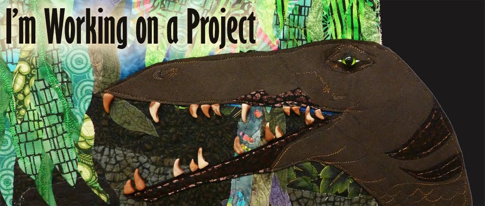
I've started on my next "big" project, although it's actually fairly small- I guess about 36" square.  It's another in my ongoing (still in my brain mostly) series depicting pieces of the Episcopalian/Catholic liturgy.

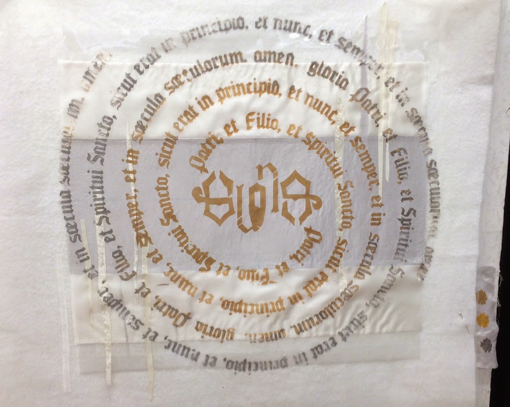
In this one I wanted to focus on repetitive meditative prayer, and the idea of a spiral with a firm calm center.  I chose the Gloria Patri as my text, and used the latin, "Gloria Patri, et Filio, et Spiritui Sancto, Sicut erat in principio, et nunc, et semper, et in saecula saeculorum. Amen."  In my design it spirals out on both sides.  I decided to screen print the text as I've had good luck with that in the past and I like the crisp edges it gives the letters.

One of the other things I wanted to try was designing my own ambigram for the center.  I've been intrigued by these ever since first seeing them in the Dan Brown thriller Angels and Demons.  I bought and stitched out the Arts/Crafts ambigram embroidery pattern from Urban Threads, but hadn't ever designed my own until now.  I spent quite a while sketching, and when I liked my design, I scanned it into illustrator and did the rest of the text layout there.  I use my silhouette cutter to cut my screens out of fusible vinyl and then mount it on organza.  This was by far the biggest screen I've ever attempted, and unfortunately, it required five separate pieces of fusible vinyl to get all the letters.  The biggest challenge with this was lining up the edges; in the past when I've done screens that required multiple pieces of vinyl, the text was in regular lines, so it was fairly easy to break the screen between each line.  This time though since the text spiraled, it was impossible to make a rectangular screen (the shape of the cutting mat) that didn't have letters partially on each edge.  Lining up the floppy vinyl screens was kind of a pain. Finally I got the screen all put together though.

Vinyl on organza silk screen.


For my background, the original idea was to use various different types, colors, and textures of white.  I even wanted some of the printing to go onto the batting.  I therefore pieced this background (with minimal piecing since printing over seams is tough) and got ready to print.  I also decided to use multiple colors- gold silver and white, with the writing getting lighter and more chaotic towards the edge.


Well, this was the first printing.  What a disaster!


The paint smeared terribly under the screen, the seams were problematic and the colors looked terrible.  I identified several specific problems, all of which were things I already should have known better about.  First, it really is important to use screen printing ink or something with thickener.  It doesn't take much runniness in the paint to prevent a good print (the gold paint I used on this try was fabric paint but not screen printing paint).  Second, seams really are a problem if the goal is a super crisp print.  Third, large screens (like my 36 x 36 one) are a no-no, especially without a frame.  My screen didn't even lay flat because of how I'd had to squish the vinyl- so I should have known I wouldn't get a good print.

So I washed out the screen, picked a single piece of background fabric (a white polyester bengaline) and started cutting up the screen into several parts.  I also switched back to the silk screen paint.

Print of the first section, much crisper:


Here's the second piece of screen taped down in mid-print:


And finally the last section of screen, taped down in mid-print:


The part with the ambigram is the central gloria.  You can see what I mean in the next two pictures:  they're taken from opposite sides of the table (but the print looks exactly the same).


This second round of printing went much better.  All the letters are nice and crisp with only a few spots where the paint didn't transfer well.  Much better to transfer too little though than too much.  Up next- how to quilt it!

Linking up with Nina-Marie and WIP: Wednesday.