Showing posts with label Surface Design. Show all posts

Wednesday, December 7, 2016

New Manuscript Quilt

You may recollect I've been working on a series of quilts depicting the pieces of the Episcopal liturgy, specifically the Holy Eucharist, Rite 2.  The next section I decided to work on is the Confession.  In thinking about this piece I decided I wanted to use my own handwriting rather than a more formal script as I've used in previous pieces.

I didn't want to digitally print it, so I started thinking about ways to get my handwriting onto fabric.  At first I thought I'd try bleach discharge using a bleach pen, but on my little samples, the bleach pen bled so much that it wasn't really legible.


Next I thought about using Esterita Austin's ink/paint transfer technique.  I'd previously used it on my seed packet quilt and thought it might work here.  Basically, you can paint or write on parchment paper, layer it with misty fuse and organza and the paint/ink is picked up by the organza/misty fuse when you iron.  Previously I'd done it with paint, which worked quite well, but for the handwriting I wanted to use marker as I'm not very graceful writing with a brush.  I did some sharpie writing on the parchment (top picture), and then did the mistyfuse transfer onto organza (middle picture).  It worked fine, but because the misty fuse has the texture of a fine webbing and the marker ink doesn't have any inherent structure to it (like a layer of paint), the ink only transfers exactly where the misty fuse fibers were.  This resulted in a sort of faint transfer which wasn't exactly what I was going for.  I tried it using wonder under instead of misty fuse since that's a little denser, but it really didn't work (bottom picture); I just got a big mess.


Next I decided to try sunprinting.  I purchased some Jacquard SolarFast, a sunprinting fluid that allows you to print in many different colors, not just the blue of traditional cyanotypes.  I got a bottle of purple and a bottle of orange.  You paint it on, then while wet, put on your items for resist, cover them with glass, and put them in the sun.  Many people print black and white photos on transparencies and place those under the glass for printing, so I figured I could write with a black marker and that would work.  I did two small test pieces on different background fabrics.  For one (Alleluia Alleluia below) I used a standard sharpie and wrote on the transparency.  For the other (Go in Peace below), I wrote with standard sharpie directly on my glass.  The two pictures are just different amounts of time in the sun so you can see the color develop.  Writing on the glass was easier since it meant only positioning one thing, but I was concerned that because the writing was on the top of the glass, the thickness of the glass might make the writing less crisp.


Indeed that's what happened.  Sorry for the terrible lighting below, I'm not sure why I had so much reflected light off these samples.  Anyway, you can see that the writing is definitely crisper and easier to read in the Alleluia sample than the Go in Peace sample.  In fact on the Go in Peace sample, you can hardly even see the words, especially on the purple.


I decided to use orange for the center of my print (where most of the writing would be) and purple for the outside ring since the writing was easier to see on the purple.  I did like the look of the purple and orange on the light yellow print background, so I grabbed another piece of light yellow tone-on-tone from my stash.  I also decided to go ahead and write on the transparency rather than the glass and use a thicker marker.  The final size of my print is about 30 x 30 so that meant a large piece of glass, transparency, and fabric to line up.  It was a bit tricky lining it all up in the dark, and then my giant sheet of glass broke in two leaving some very sharp edges, but in the end I got it all layered up and into the sun.  Here it is mid-print.  The thing that looks like a white string across the top is actually the place where the glass broke.  I had to hold it together with clear packing tape.  If you look closely you can see the transparencies underneath (where the writing is).  The little whitish squares are the scotch tape I used to hold the transparency sheets together.  Unfortunately you can't use the transparencies without the glass overlays because they blow away. 


 Here's how the final print turned out.  I like it- the text is subtle, but legible if you look very closely, which is fine with me.  I have great plans for how I want to turn this into a quilt, but sadly there are a few more high-priority things in the pipeline right now so it'll be the first of the year or later when I get back to this.


What kind of experiences have you had with these techniques?


Wednesday, March 20, 2013

WIP Wednesday

Hi All!  I can't even remember the last time I did a WIP Wednesday post.  I finally feel like I might be glimpsing the other side of the chaos though, so bonus!

Two exciting pieces of information from around here, Seymour got a second place ribbon in the pictorial category at the Dallas Quilt Festival, and my unblogged-about-quilt "in nomine Patris" got accepted into SAQA's Text Messages show which will debut at Houston this fall.

Recent Finishes:

-My covert robin swap package (secret partner- I mailed it this morning!), a blog post about that should be coming soon.
-Birthday presents for Anna!  Can you believe she's 1?  I certainly can't.  I'll hopefully post more about her presents later as well.
-My Handprinted: a fabric swap III fabrics (not-so-secret partners, I mailed these this morning too!).

I started out by hand-dyeing these three different half yards.  They're all PFD broadcloth from Dharma.  The top two I just scrunched up in the dye, the third one I folded up to give some fun lines.


Then I made some fusible vinyl silk screens (like here) and printed my fabric!  The trees were inspired by my latest orchard quilt, blog posts about that to come.  Some of them have "roots" where the vinyl started to come off and make drippy bits which is not ideal, but I guess contributes to that "hand printed" look.  The bottom one, which I think looks like bats, was actually a left over screen from "in nomine Patris".  It's not actually a bat, just a little flower motif, but all by itself here, I think it definitely looks like a flying creature!  Partners, I hope you like the fabrics I made!


Works in Progress:

Sierra Blanca quilt-  This is the next one to finish
Orchard quilt- This will be second in line
Dogs-  This is my big you-will-finish-this-long-languishing-UFO-this-year project, but I'm honestly not sure when I'll get to it.
Hand-pieced star miniature-This is my handwork project but lately I've been itching to finish it.  I'm determined that it will be a competitive miniature, although I'm not sure how likely that is given my general imprecision (part of why I'm a more free-form quilter) and the phenomenal miniatures that show up at shows.  Anyway, I've been dreaming about this one at nights though, how I'll do the borders and the quilting, and I feel compelled to work on it.  Interestingly, my hand piecing seems to be a bit better than my machine piecing, so that's good I guess.

Anxiously waiting to start:
Projects for the new baby!  Anna will have a sibling arriving sometime in September (yipee!) and supposedly we'll know its gender in April.  As soon as that happens I'll be busily making things for it!

Hope you guys are all making progress on your WIPs!  Linking up with Lee as ever!


Wednesday, January 11, 2012

Make your own silk screens

My mom and I typically like to try some new surface design or dyeing technique over the holidays and this year we decided to try silk screening.  We'd always avoided that in the the past since it seemed really complicated.  The photo-emulsion stuff is pretty specialized and the whole process seemed a little involved.

Excitingly, in the October/November 2011 issue of Quilting Arts we found an article on easy make-your-own silk screens by Enid Gjelten Weichselbaum.  Basically, you take a piece of iron-on vinyl and cut your desired pattern out of it then attach it to a piece of organza.  There's really nothing more to it; we did put masking tape around the edges but that was it.  Squirt a little silk screen paint on it and squeegee away with a credit card.   We used plaid silk-screen paints as well as setacolor fabric paints thickened with a little bit of sodium alginate.  We did find the process worked best with small screens (smaller than about 5x7); any larger and the prints weren't as clear because the organza was really floppy.  I think for bigger prints it would be better to have the organza on stretcher bars as in traditional silk screening.  This technique was really fun and easy though for small screens and printing!

Here's one of my first screens and the initial test prints we made on muslin.  We made our screens on purple organza because it was on sale, it didn't seem to matter any in terms of the print quality.


I initially made two screens vaguely inspired by my bathroom wallpaper, and I decided to make a medallion pattern with them.  We initially tested on muslin, but I printed my medallion on some sort of pre-washed white-with-green sprinkles batik I found in my mom's stash.  Here are a few shots in progress. The blue lines are water soluble marker I used just to line up the medallion wedges.


Here's my final medallion.  I discovered that you can easily tape over some parts of the screen if you just want to print one section of it as I did with the outer green tear drop shapes.  I'm not sure what I'm going to do with this; incorporate it into some art quilt I'm sure.  It reminds me of spring though and I'm pleased with how it turned out.


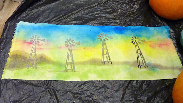
My mom did a windmill screen the first day.  She has some ongoing windmill projects incorporating both traditional an modern windmills.  Here are a couple of the things she printed.  In the first one she's going to applique a large modern windmill in the foreground.  This was standard printed fabric and the screen printing worked fine.  In the second one she was experimenting with painting the background with setacolor after screen printing.  The screen printed images acted like a resist and weren't covered with the background paint.


Finally, my sister asked for a printed bib for the baby, so we tried screen printing on the knit/terrycloth fabric that little bibs are made out of.  It worked just fine!


We had so much fun the first day, both of us made more screens the second day.  My mom made a bunch of different sized leaves and printed them on some fabric she'd previously hand-dyed.  I forgot to take pictures of it; it looked really cool, but that was how we learned that the larger screens didn't work as well.  The larger leaves got kind of blobby and didn't print as crisply.

The second day, I used a piece of commercially printed fabric which had a subtle brown-pink-blue rose pattern and some little white specks on top.  Before I printed on it, I painted the background with setacolor paints.  The little white speckles acted as a resist and showed up on top of the painted surface.  I then made a bunch of quail screens and printed a whole family of quail.  I'm not quite as crazy about this one as the medallion, but the quail are fun.


This was a super fun project, much less messy than typical dyeing projects although you do have to have a sink to rinse the screens.  They can be reused multiple times and the technique was very easy. Here are my mom and I mid-laugh; you can tell by the silly picture that we were having fun!


I encourage you to snag a copy of the magazine and try it out!  Anybody else do fun-easy surface design techniques lately?

Linking up with Works in Progress Wednesday, maybe the great ladies over there will have some suggestions for what to do with these dyed panels!

Monday, August 29, 2011

Easy Gradient Dyeing

My mom has done a variety of fabric dyeing experiments, in many cases with great success.  I'd never really tried it though and don't really have a space in which to make that kind of mess.  I was inspired however by the easy do-it-yourself gradient dyeing article in the December/January 2010 issue of Quilters Newsletter, so last year at Christmas my mom and I tried it out.  She has a large pottery studio attached to her gallery which provides the perfect place for trying out messy projects.

The first step was to wet your prepared-for-dying fabric (from Dharma, along with dyes and soda ash) and spread it out on a plastic bag.  Then fill up a 1 oz squeeze bottle with your dye mixture and squirt it along the top of your fabric.  When half the dye is gone, fill the bottle with water (effectively diluting the color) and dye the next part of the fabric.  Repeat until out of fabric.  It worked really well actually and we made several pieces of different colors.

Here's my mom demonstrating the technique, as well as some of our results.  That's Jackson the carpet dog in the picture with my mom, so-called because his fur feels like a berber rug.  It's a good think we didn't dye him- he'd look like a circus clown.


I was really pleased with the way our pieces turned out.  There seems to be quite a bit that goes into dyeing though, especially if you're trying to get specific colors.  True blue and true red both seemed elusive, although green, turquoise, and purple were easier.

During that same week, we also tried some dyeing based on a Japanese Shibori technique.  There are a lot of ways to do it, and I'm not an expert by any stretch of the imagination, but it's basically really advanced tie-dying.  You stitch, gather, fold, and tie the cloth and then dye it to give cool patterns.  My mom made a little mountain sort of scene with hers while I did a sort of abstract leaf.  Up next, I'll show you what I made with them.


Friday, August 12, 2011

Easy Friday Project-Phototransfers

Since it's Friday I thought I'd show a quick-easy-do-it-in-an-evening project.  I've made quite a few of these photo-transfer projects over the years.  These were all made with the inkjet printer fabric you buy at JoAnn's although recently I've been experimenting with the products that enable you to make your own printable fabric.

Usually I just print a picture, add some borders and then either quickly quilt it up into a wall hanging or make it into a pillow cover.  Easy-peasy personalized present! Here are some of them;


These are Mike's adorable grandkids Raegan and Walker, I made them these pillows for Christmas last year. Walker loved Thomas the Train.


I made this one for my grandmother using photos that were left over from making a memory quilt for my grandpa.  It's been well sat on I think.  

Here's one I made into a wall hanging and kept after my sister and I had our cousin out to visit a couple of years ago.

And here are three more pillows I made for my mom and some good friends commemorating a great ski trip.


The phototransfers make great wall hangings and birth commemorations and quick memory projects.  There are all kinds of cool digital manipulations you can do with photos and fabric, but even just printing them out and sewing them into blocks like this makes a fun project.