Showing posts with label Tiling. Show all posts

Wednesday, October 28, 2015

Peace Be With You: Bloggers Quilt Festival

It's time once again for the fabulous Blogger's Quilt Festival. It's always a great opportunity to find new quilty bloggers and see everyone's lovely work.  Many thanks to Amy for hosting it!

Peace Be With you is my entry in the Art Quilt category, and you should click through to see all the other great entries.

I worked on this quilt for most of the spring and summer, but was unable to show final pictures of it because I entered it into a special exhibit called "Festival Gallery of Quilt Art: Just Sayin" at the International Quilt Festival in Houston and they had a rule about not showing the final quilt before the show opened.  Well now it's opened, so I can finally share it!!  For anyone who's able to actually go to the show, you can see it there in person.

Peace Be With You, 48" x 50", c. 2015 Shannon M. Conley


This piece is another one in my series of liturgical quilts, many of which are stylistically linked to illuminated manuscripts or texts.  The composition of this one was inspired by a really glorious piece of Arabic calligraphy.

It started with four tiles I designed earlier in the spring while at a workshop with Jenny Bowker. Once I settled on a composition for the whole piece, I made two more partial tiles to fill in the gaps.


Designing the text to fit in the circular piece was fun.  It's a bit hard to see at first glance, but there are two interlocking rings of text.  The outside of the circle reads "Peace be with you" while nestled along the inside is the response "And also with you".  This is the greeting parishioners exchange with their neighbors during an Episcopal worship service.  The letters are all cut from different synthetic gold fabrics and then appliqued down using a tiny zig zag.  While quilting, I then couched down the Ricky Tims Razzle Dazzle thread to give a little more definition.


One of my favorite parts is the border around the circular/tile parts.  I foundation pieced it using all my shiny gold fabrics and between the foundation (a leave in stabilizer) and the seam allowances under the piecing, it really puffs up nicely.


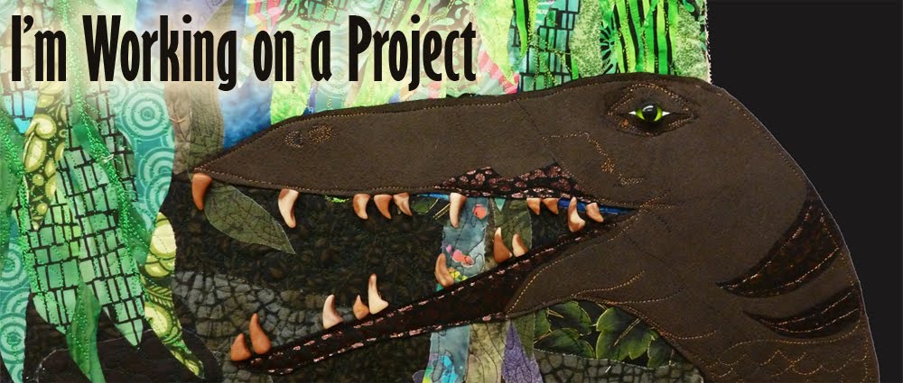
The background fabric is some sort of slightly stretchy heavyweight polyester apparel fabric, and up close it has a really nice sheen.  Unfortunately, the stretch made it a bit difficult to work with while squaring up/quilting.  The quilting was done free motion, but I did mark some of the patterns first, especially those along the very outer border an in the bottom.  In order to echo the dragons hiding in the tiles, I quilted a dragon in the bottom part.


Though I struggled a lot with this piece (from a practical-accomplishing-it) standpoint, I'm pleased with how it turned out, and I hope the message can serve as a reminder, to me at least, to reach out with kindness to those around me.  I feel like society at large is becoming increasingly polarized, and that my life in particular has been filled with stress and conflict, so that a little patience and peace might serve me well.

Thanks again to Amy for hosting the Bloggers Quilt Festival, and make sure to click through to see the other entries!!


Tuesday, July 21, 2015

The eyes have it!

I finished quilting my big dragon tile quilt over the weekend and soaked it to remove the blue marking pen.  Unfortunately, one of the blue fabrics in it bled all over one of the two white tile backgrounds, and I was horrified.  I followed Vicki Welsh's excellent tutorial (thanks!!) which primarily involves soaking in soapy hot hot hot hot water for many many hours.  My water kept turning blue so I guess that was good, but constantly boiling water and pouring it in the bathtub got exhausting. Plain hot water from the tap helped too, but I thought the boiling would be better.   After about 22 hours of soaking, the blue hadn't completely come out but it had evenly and lightly stained all of the white background.  I was really surprised that one of the two white background fabrics (both cotton!) just sucked up the blue and the other one is as white as ever.  In any case, now my tiles are white and pale blue and that's just good enough.  Unfortunately all that soaking made some of my other fabrics wear weirdly and the blue dye also backstained some of my gold fabrics which now look very dingy, but I'm just ready to be done with this quilt.  Incidentally, I didn't take any pictures of the blue/white but if you look at the first picture below you can see a little of the fabric that stayed white on the left and the one that sucked up all the blue dye on the right.

I blocked it, squared it up, sewed on the facing strips and then decided I should stitch the beaded dragon eyes on before flipping the facing strips around.  So here for your consideration are several different beaded eye options:

I started out with a red bead on a black sequin, but I thought that made my dragon look too mean.

I'm now trying to decide between the next four:

1. Gold eye on black sequin.


2. Gold eye on black sequin with short green beaded eyebrow.


3. Gold eye on black sequin with long green beaded eyebrow.


4. Black bead on black sequin with pink accent bead.


Which is your favorite?  Other suggestions?  I always appreciate the input!

Friday, July 10, 2015

Back for the moment

It's been a full month since I've posted here, and luckily three weeks of that time was a lovely vacation with Mike in Alaska.  It was a really wonderful trip- definitely relaxing and beautiful.  I'd love to go back.

Since getting home things have been crazy in both expected and unexpected ways. This week has been full of outside obligations, but I had a little time last week to work on my Peace quilt before heading to my parent's for the 4th of July holiday weekend.

I have a few things to post and share when I can get organized enough to take pictures, but at the moment it feels just like trying to keep my head above water.  So for today I'll leave you with a snapshot of my quilting from last week.


I hope everyone had a great Independence Day and that you're staying cool and dry this summer!  In keeping with the 4th of July feeling, here's one of my pictures from Alaska.


Friday, June 5, 2015

Progress on the tiling piece

It's been a while since I updated on the piece I'm currently working on.  In contrast to the QN piece which feels very last year (in my weird brain), this piece feels very immediate (and currently irritating since I'm struggling with monofilament quilting).  In case you don't remember I started with these tiles I designed while in a workshop with Jenny Bowker.


I decided to incorporate them into a piece to fit into my ongoing liturgical series.  In addition, the timing was right to try to finish it in time for the current open call for entry for a quilt with a quote or saying on it.  The show is one of the  IQF ones this year (I think it's actually called "Just Sayin").  I decided to feature the text from the peace; the time in a traditional Catholic or Episcopalian service (maybe others too?) when congregants greet one another.  The actual words in our prayer book are "The peace of the Lord be always with you" and people respond "and also with you".  That was too many words to fit in my shape though, so I went with the more common greeting between people- "Peace be with you.  And also with you".  Inspired by a gorgeous piece of Islamic art/tile work/illumination, I decided to fit my words into a round piece to go in front of the tiles.

Here is my paper pattern as I was drawing all my letters into the round shape.  It was tricky to get them to angle properly and fit right.  I'm not 100% pleased and a typographer or calligrapher probably would have done much better, but it was the best I could do!


And of course I then cut the letters out of four different colors of gold fabric (because you always need more sparkle).


Here they are all fused down.  In case it's completely illegible, it reads "Peace be with you" around the outside and "and also with you" around the inside.


Then for the tile borders I decided to make myself crazy and foundation pieced this chevron pattern.  All these fabrics are different golds (about 10 I think) all different weights and textures, all ravelly and all a giant mess, but I love the way it turned out.


Here it is so you can see more or less the main composition.  There is now a big (6-8") solid maroon border that goes around the whole thing.

I decided to bind the edges of the gold pieced border and the round part since there were a bunch of raw edges.  The gold border especially was way to thick to turn, but I really wanted it to be on top.  I also couched sparkly razzle dazzle thread aroudn all the letters and I hope that makes them a bit easier to read.


Linking up with Nina-Marie as always!  Mike and I are leaving for Alaska on Saturday, keep your fingers crossed we don't get caught in a tide or eaten by a bear.

Friday, April 24, 2015

More Tiling and a Book Giveaway

For details on the book giveaway,  just scroll to the bottom!

I've been talking about designing tiling designs in the workshop my mom and I took with Jenny Bowker.  Since then I've been working on actually turning one of my designs into a quilt.

These are the tile designs I started with.  I drew them to be as similar as possible except one has the dragon head and one has his tail.


Here's the computer mockup of what they look like tiled.  Again, sorry for the awful colors, it's just an attempt to get an idea.


I decided I'd make mine fusible applique and zig-zag around the edges with invisible thread.  Jenny encouraged me to make the blocks quite large (~16") since they're pretty detailed and would have more visual impact if they were larger, but I really really wanted to use up the little bitty pieces of fabric I had left from cutting out the animals in these two quilts.  It was really a lot of fabric, all with fusible already on it, but small weirdly shaped pieces.  As a result my blocks are about 11" (finished).  That really is too small, but I'm persevering!  Here are the blocks-  they'll be on a darker background and right now they don't line up right.  Hopefully this is because they each have a bunch of seam allowance (which will be turned under), but I think lining them up will be tricky.  I think they'll be more dramatic once I've quilted them, and the dragons definitely need eyes, probably a bead, but I'm liking them so far.


And now for the giveaway.  A long while back, a call for submissions came out for quilts to be included in a book called 1000 Quilt Inspirations: Colorful and Creative Designs for Traditional, Modern, and Art Quilts  My mom and I were both lucky to have quilts accepted into it, and after many months, hard copies finally arrived.  It's full of wonderful quilts,  definitely super inspiring eye candy.  A couple of things I really like, one is that (as the name suggests) it contains really a wide variety of different types of quilts.  The second is that it contains lots and lots of detail shots, so you can see up close what people have done or stitched.   I'm giving away a copy, just leave a comment below and I'll use random.org to draw a name on the afternoon of Friday May 1st.  Any kind of comment is fine, if you feel like it, tell me whether you're a pet person and if so, what kind of pets you have.


And of course, always linking up to Nina-Marie.


Friday, April 17, 2015

Tiling

Last time I mentioned that my mom and I took a tiling workshop with Jenny Bowker on our last trip to Asilomar.  The class was a five day workshop and about half the time we spent just drawing and designing tiles, doing different exercises and watching the way patterns and designs repeat and change in the process.  Ever since I spent time in Spain in the late 90s, I've loved the look of Mediterranean and Islamic tiles, with their repeating patterns and bright colors, so it was fun to take a class with lots of drawing and designing things like that.

This was the first exercise: draw three lines (maybe with an echo on them) on a piece of paper folded into eighths and see what kind of patterns you get.  Pick your favorite and see what happens when you trace it out and start repeating the single tile.  In the second picture, you can see a variety of options for edges and corners, using pieces of the same original tile.


Next, practice with shapes.  The idea is to have a repeating tiling pattern, rather than a shape splotched down in the middle of a block, so the shapes go off the edge. We first worked with vessel shapes since they were easy to draw and then experimented with what happened when multiple shapes were used on the same block and what would happen if you changed the size of the shape within the block.  My first attempt (first picture left and second picture) used a single pot on the tile twice.  Coloring it in helps with seeing the pattern, and one of the things Jenny suggested was using slightly different colors on each tile, that is, if you have a purple pot, use different purples on each tile to give the kind of variation you might expect if you were tiling a wall with handpainted tiles. For these exercises I was just using a limited palette of colored pencils, but you get the idea.  For the second tile, I used two different pot forms


Here's another version of the same exercise, same pots as above but a bigger tile so they are more spread out.


One last pot attempt-  I didn't even color this one in since I felt like the proportions weren't quite right-  the top of the pot overlapped the bottom of the next one, but not enough to feel intentional, only enough to look uncomfortably close.


Here's a similar exercise with different shapes.  My mom drew some fish shapes, and I drew some mice.


We then practiced making tiling designs that had mirror image symmetry and rotational symmetry.  I somehow managed to skip the mirror image exercise, but jumped in with two feet into some designs with rotational symmetry.  We started by just drawing 1/8th of the tile on a diagonally folded square and expanding from there.  In the evening after the class, I took pictures of my tiles and colored/repeated them in photoshop.  The colors are pretty yucky looking- filling things in on the quick and dirty on the computer is harder than you might think but you get the idea.  One of the most important things Jenny emphasized was that you really have to look at how the tile repeats to see if you'll like it since many secondary patterns only emerge in the repeats.  

one tile

four together

many together
 On this one (above) I was really unpleasantly shocked by how strong the plaid feeling was.  I had no idea that would emerge.  Even if I changed the colors, it was still pretty dominant.  I love a plaid as much as the next person, but because of the way I drew the tile, It really became the main thing you see.

The one below was more successful on that front, I love the different patterns you get where each of the four corners intersect.  The only think I wasn't crazy about with this one is that all the elements were about the same width/weight, and I thought it needed a bit of variety.


After doing these exercises most of us picked a tile we liked and started interpreting it in fabric. One of the things she suggested we think about when designing was what kind of things and what amount of detail we were willing to applique.  For example, for turned edge applique my design with the thistle would have been nightmarish.  The other thing she talked about was what to do with the tiles.  Obviously you can make a quilt with just the tiles, and I think this would have a feel like a lot of the traditional pieced quilts, where secondary patterns emerge in block intersections etc. One challenge with this for me, is that I'm usually happier when my quilts have a specific focal point (part of the problem with my previous printed tile project- thanks LeeAnna!).  Jenny usually uses tiles as part of a larger project, which appeals more to my design sense.

Next I'll share the last tile I designed and my progress towards turning it into a quilt!